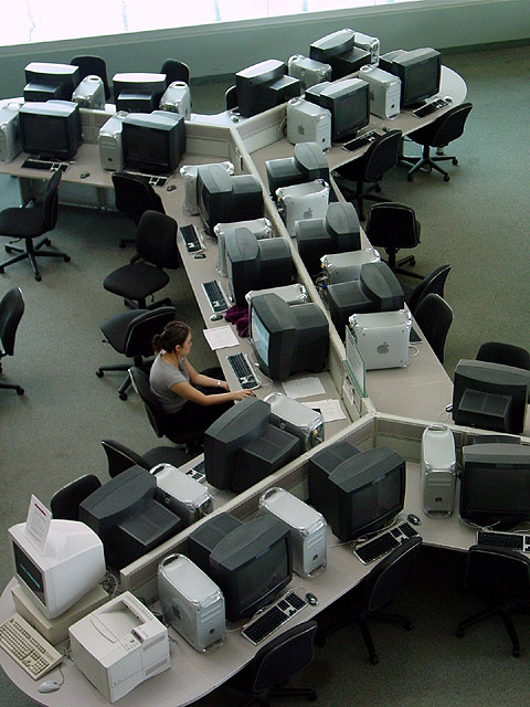
I gave it a 9. what I like about this picture is that the girl and the purple thing in front of her are the only "friendly" colours. The grey and black and white colours of the desks, chairs and computers make me understand what "sick building" syndrome is. The only thing that bothers me is the bright window.
I know that feeling all too well! *Shudders*. Very good use of space to create that stomach churning feeling that "I'm the only one who hasn't finished this yet".
This is awful close to a 10. I am a little thrown by the intruding window edge at the top of the photo, but the space in this photo accentuates the student's (ostensibly) daunting and solitary challenges.
I like this a lot - and it's not just because I like Macs! :) Very pleasing composition - nice almost monochromatic tones. I think this is a good example of how negative space does not have to be a plain texture or single color - the neg space also provides the interesting context for an otherwise humdrum subject. The layout of the other workstations is interesting from a graphic design p of v. I wish the chair at left middle wasn't there, though. Nice job!
Beautiful photography, originality sets it apart from the ofther submissions. Others may tell you it doesnt meet the challenge, but I think it's perfect.
This is great! In my opinion, this is exactly what the challenge was requiring. The computers are the "negative space" here, helping to bring out the student subject.
wow... this would have made a great entry to the fruit/veggie challenge with all those apples :) Ok.. lemme get this out of my system first... Is this negative space or empty space? is there a difference? who knows.. I'm sorta lost on this topic myself :) I do like the shot... good work :) = 7 - jmsetzler







 Add photograph to your favorites
 Add photographer to your favorites


