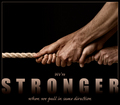
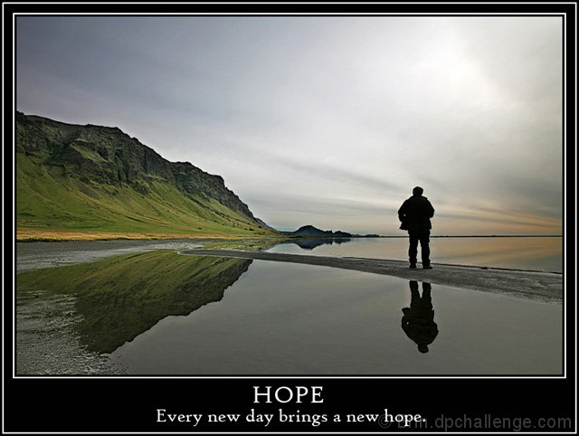
The photo carries this poster,and obviously carried it right to the top 10. Really super shot.
Probably the only reason this didn't climb all the way to top 3 is the font. The message is a bit small (the photo is there to reinforce the messsage, not the other way around) and the font is lackluster. Also the white font and border is rather jarring against the wonderful muted tones of the photo itself.
Great shot, and it scored very well.
Thanks a lot Router for your good critique, I totally agree with you.
The photo carries this poster,and obviously carried it right to the top 10. Really super shot.
Probably the only reason this didn't climb all the way to top 3 is the font. The message is a bit small (the photo is there to reinforce the messsage, not the other way around) and the font is lackluster. Also the white font and border is rather jarring against the wonderful muted tones of the photo itself.
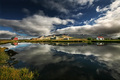
Nice photo, seems to be a bit of banding in the sky and the area between the man's legs is lighter than the rest of the water. But that is just nitpicking!
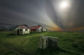
good shot, but to me doesn't show hope. looks rather like an evening than a dawn - a higher saturation had probably helped. typeface is a bit boring and so cannot convey a positive feeling, too. outer white border is unnecessary IMO.
Really well done. I love the image and the text. I don't like the frame much, but the strength of the image makes me forget the distracting border. (9)





 Add photograph to your favorites
 Add photographer to your favorites


 Photographer found comment helpful.


