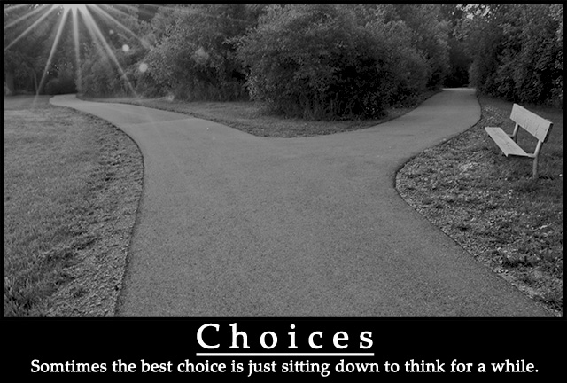
Yippee! I'm glad to get closer to the -6- range. Thanks to posthumous for noting that the flare is an important symbol. I was also thinking of the light as a temptation. Sometimes we are drawn to that glorious/bright path when the better choice might be less well illuminated & clear.
I also intend to follow up on many of the suggestions regarding font, lighting and techo's idea to try keeping it in color. I am going to print this one for my classroom, so I want to refine it some more.
the flare is an essential part of the picture (one path is lit, the other shaded, emphasizing that a choice must be made) and the grayness of it helps to emphasize the white text. this is a good poster.
I was really hoping this would do better but congratulations on the new personal best! :)
I agree the shot needed a little contrast tweaking, some Shadow/Highlight tweaking... brightening up the shadows and bumping up the midtone contrast. The flare doesn't bother me, it could be seen as a feature of the shot, or not. It's like it signifies the spark of thought and ideas. Either way, the main composition is really good. Any chance you think it would've worked better in color? About the text, perhaps the bottom text being non boldish but of the same design would've looked more refined. But for the me the shot and the words that go with it are a big motivation. Sometimes we do have sit down and look at the world from the side, out of the stream of the fast life.





 Add photograph to your favorites
 Add photographer to your favorites


 Photographer found comment helpful.


