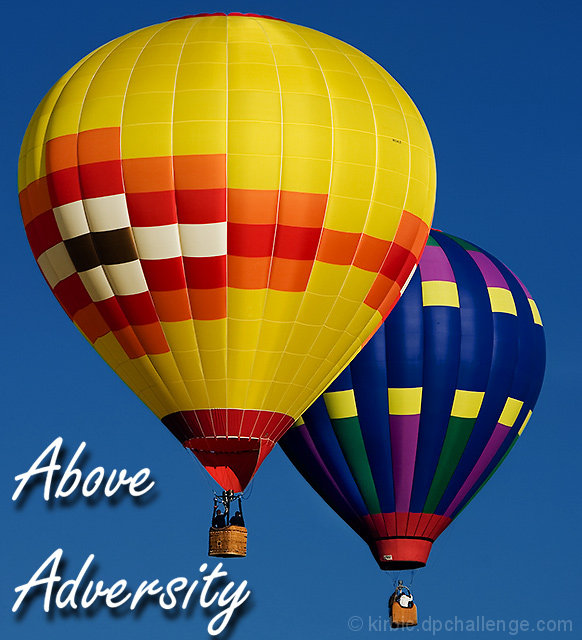
Beautiful, clear image, the clarity is quite exceptional. It's a great picture for a poster, and yet, as it is, IMVHO it's not quite working as a motivational poster. The message is not particularily clear. The placement of the message, almost on top of the balloon, seems off somehow (plus the shadow of the last "y" is cut off). I do like the shadow lettering though, it gives the sky a sense of depth. Maybe it just looks a bit crowded overall to me. Great picture though.
Amazing photo, so clear and bold and bright. Hate the text, sorry! This would look great with a black border and text similar to the motivational posters you see in stores.
I love your image, the colors are awesome and great clarity.
1. You could have used a liberal crop to include more sky to make your message more impactful ( above is something- and that something is not percived in the image)
2. The text chosen by you is not motivational in the true sense of the challange but im not a DNMC freak so - 8






 Add photograph to your favorites
 Add photographer to your favorites

 Photographer found comment helpful.


