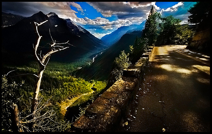
post-processing = lots dodge and burning to bring out the river, the stone wall, parts of the road, and to increase contrast in the clouds.
Then curves coupled with shadow/highlights to get the contrast, bumped contrast.
Looking back on it, this photo looks pretty unrealistic and i way overdid it on contrast and saturation, i should have stepped back and looked at the picture from afar.
Its a shame because I have 2 or 3 other photographs from the month which i really really really thing would have done a lot better. You live you learn.
Here is the same picture taken on a different day :D
Statistics
Place: 219 out of 503 Avg (all users): 5.8690 Avg (commenters): 6.6000 Avg (participants): 5.7723 Avg (non-participants): 6.0909 Views since voting: 1378 Views during voting: 233 Votes: 145 Comments: 12 Favorites: 4 (view)
im split between your 2 takes of this shot. in this take i LOVE the high saturation and the crisp details i feel like the dynamics of the edit stray from your typical editing ( which is neither good nor bad) and i wouldnt have thought about this shot being edited any other way until i saw the other version. i really think the other version is more your style ( whatever thats supposed to mean) and i actually prefer the diminished contrast that gives more texture to the trees and to the winding road by removing the powerful lines drawn by shadows. either way i love the shot
WOW .. ANOTHER brilliant photograph and impressive edit .. you have a wonderful creative approach and i love your dramatic results ... :)
i've just read shawn's comment and learnt another valuable lesson in dpc ... the bit where he says he brings back his original and compares it with the processing he's done to see if he's gone too far .. i go too far A LOT so i'll be using that technique on my next edit .. i often go away from the computer and do something else and then come back, to get a fresh look, which often works too ... :)
Adam - yeah, I have to agree with Jeff on this one. So much so that I didn't even recognize the portfolio version when browsing through your stuff last week. I did give this one a 6, but my vote was down mostly because of the extreme obviousness of the valley dodging at first glance. The more you look at the piece, the less it seems like it was edited & more natural the light along the river appears - that may have been where you got into trouble with voters like me. That first impression can do you in sometimes! The other part I may have subtracted for was the blooming highlights on the foreground branch.
Sometimes, after I'm done editing a composition, I'll bring back the original shot to see if mixing it in will reveal some areas where I went too far. I think this is a good example where you may have found that technique useful as well!
Weird, I was browsing your impresiive portfolio earlier and saw this same shot, think I like the other version better. The processing in this one is dramatic, but maybe a tad bit too much. Still a wonderful shot, looked like a great trip.
I really like the contrast in this photo. It is very powerful. If there was a little more detail in the mountain on the left, this photo would be amazing.
excellent scene - the lighting on the valley and the road is outstanding but I really am not a fan of the processing on the sky - the blue just seems too blue






 Add photograph to your favorites
 Add photographer to your favorites


 Photographer found comment helpful.


