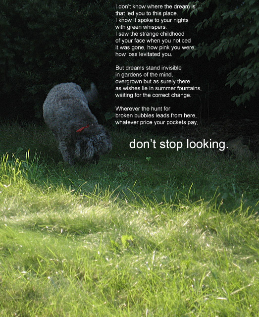
a motivational poem. I cropped the photo, but the light was perfect. Any attempt at levels or curves just made it worse. All I did was some hue/sat to bring down the yellow a touch, then a deep emerald photo filter. The top part is sharpened, the bright foreground is not.
===post-challenge====
I've got two things working against me. I have a bright monitor and I tend to like things a little dark.
But I was very happy to see people liked the poem. I wrote it for this photo. It's not often I write a poem in Photoshop! hahaha
Statistics
Place: 154 out of 165 Avg (all users): 4.6720 Avg (commenters): 5.9000 Avg (participants): 4.7015 Avg (non-participants): 4.6557 Views since voting: 1134 Views during voting: 330 Votes: 189 Comments: 20 Favorites: 0
Obviously voters in this challenge had one specific style of 'poster' in their minds, and the entries that stuck prety close to that ideal tended to do better than those that followed a different path.
Motivational posters are propaganda - nothing more, nothing less. Wether or not they are art is secondary to the fact that they are designed to inspire a very specific feeling in the people who look at them. They do this through 3 things
- message
- photo to reinforce the message
- font and text placement for maximum impact
This shot has a clear message. Making the catch-phrase larger than the rest of the poem was a smart move because you get about .047 seconds to get the message across so it had better be obvious.
This photo works well to reinforce that message. However the dog looking for something is such a small portion of the overall scene that its impact is greatly reduced. A much tighter crop focusing on the dog sniffing around on a patch of yard would be stronger and would also likely avoid the great shifts between dark and light that follow the poster from top to bottom.
The font used here is very lackluster and the message's placementin the scene is a bit haphazard. However, if done consciously, placing the catch phrase right at the spot the dog is sniffing was an excellent choice. Again, imagery to reinforce message.
Obviously this challenge called for skills (or at least the ability to copycat other's skills) that aren't entirely photographic in nature, so it was a tough one for many.
I absolutely love the poem!!!! It was very hard to read in this small format (at least on my monitor). I see the dog is searching in a garden, but the image is not motivational to me. I think the poem deserves better.
I looked at the shot first and thought you had it backwards, lightwise.
Then I read the poem and it fit perfectly, highlighting the invisible dreams in the overgrown garden.
lovely poem and goes well with the pic. I think you could have cropped off a little of the grass at the bottom to give more attention to the words. I wish the text were just a little stronger (or bigger) - my old eyes need the help lol.
The photo is a little bland looking and the foreground grass is too prominent, IMO. I think if the dog had some more fill light on it or dodged some in post it would work a little better. I do like the quote and you did a good job placing it against the darker background.







 Add photograph to your favorites
 Add photographer to your favorites

 Photographer found comment helpful.


