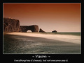
Ok. I didn't study motivational poster designs , perhaps I should've but also like the challenge of trying something a bit differently. Will post the outtake layout.
Being so small. The side green text I understand isn't as clear as I would've liked myself. But imagine it would look nice real poster sized :)
~~~
Thanks for everyone's comments. Appreciate it. I know I may have blew my top10 placement chances with the typography. But a 6.68 ain't too shabby. So thanks for your support :)
Statistics
Place: 16 out of 165 Avg (all users): 6.6842 Avg (commenters): 7.3889 Avg (participants): 6.4328 Avg (non-participants): 6.8211 Views since voting: 2691 Views during voting: 477 Votes: 190 Comments: 25 Favorites: 5 (view)
Hard to find anything wrong here. I LOVE IT!! Poster layout is nice as well. Not 100 % sure about the lettering for the 'strength in..' words. Either the font or the color is making it slightly hard to read. But no biggie.
i like the image but its not really conveying what you are trying to say as all the droplets are not conveying any team effort. Though this doesn't take anything away from your beautiful image 8







 Add photograph to your favorites
 Add photographer to your favorites

 Photographer found comment helpful.


