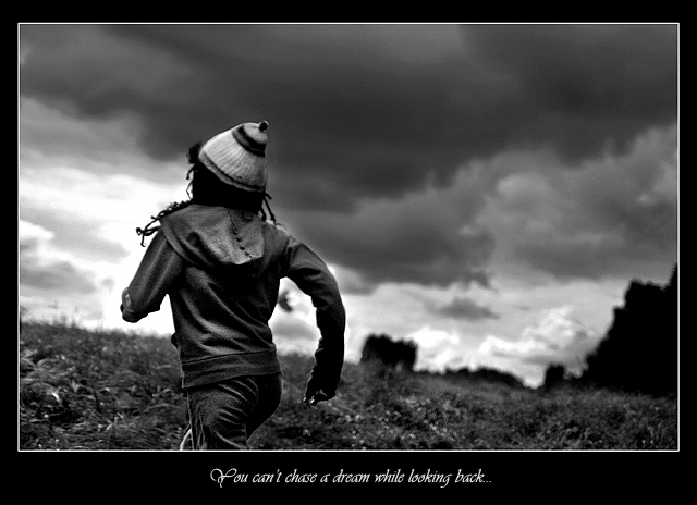
Well... I don't like this but I looked upon it as a chance to learn how to put text on a picture, which I did, but it always looks small even at 1296 pt. Maybe I'm missing something, but I predict low 5s for this one... also, the hat looks weird. Dang layer masks.
Anyway. The editing steps were:
Levels,
Shadow/highlight x2,
Midtone contrast,
Layer mask for the sky and adjust levels to make it look moodier,
Bit of dodge/burn,
Contrast,
Brightness,
USM,
Resize,
Add border but elongate the top and bottom then crop the top part so it looks like it does,
USM again after resize,
Add text,
SFW
Statistics
Place: 44 out of 165 Avg (all users): 6.0773 Avg (commenters): 7.0000 Avg (participants): 5.8000 Avg (non-participants): 6.2171 Views since voting: 1504 Views during voting: 357 Votes: 194 Comments: 12 Favorites: 3 (view)
Love the shot. Great text added. Would have liked to have seen her feet or just more of the entire body in the frame. The black and white adds dynamics to the photo.
overall a bit too much contrast. placement of the person is not viewer-friendly, as he/she runs out of the frame. layout is Ok, but not overwhelming; text could be larger.





 Add photograph to your favorites
 Add photographer to your favorites

 Photographer found comment helpful.


