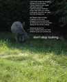
Whenever possible, you should try and submit an image that is as large as allowed by the ruleset and conforms fairly closely to the classic ratios we are used to seeing (2:3, 4:5, etc). This image looks a bit squashed due to the crop.
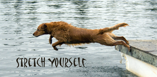
Great capture and it works well with the quote. There may have been other quotes that might have resonated better with viewers (look before you leap comes to mind), but this is ok.
The font choice doesn't work well at all. Perhaps it is supposed to give a humorous feel? There's just nothing about the image that a far-east sort of font complements or is complemented by.





 Add photograph to your favorites
 Add photographer to your favorites


 Photographer found comment helpful.


