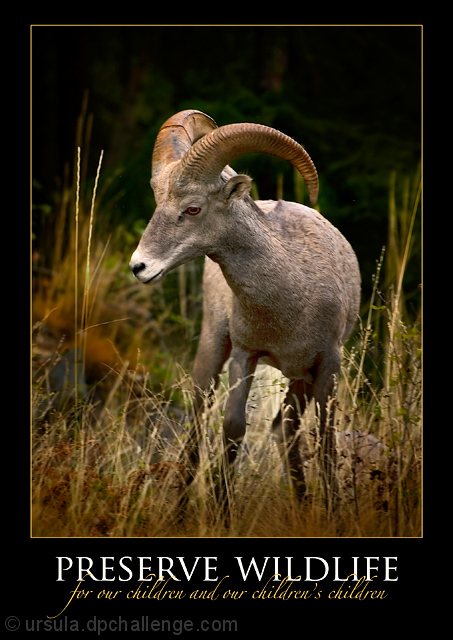
The sheep was photographed from the road that goes from Castlegar to Syringa Park, not too far from Scotty's Marina. Made with the D70 because I had the macro lens on the D200, long lens on the D70. Handheld, evening light, used the car's window edge for support.
Shot RAW. Worked on the image of the mountain sheep first, opened in PSCS3, adjusted curves, darkened colours, cloned out imperfections, dodged/burned in 50% gray layer. Added border (both the coloured inline and thick black border). Added text. Flattened, resized, sharpened, saved for web.
I was tempted to clone out or tone down the two grass stalks in front of the sheep, but the image looked "too dry" with them gone/toned down. I liked it much better this was, it has context and a sort of natural frame.
I hope this one does well, I like this kind of picture a lot.
Statistics
Place: 21 out of 165 Avg (all users): 6.5801 Avg (commenters): 8.2222 Avg (participants): 6.3333 Avg (non-participants): 6.7119 Views since voting: 2861 Views during voting: 353 Votes: 181 Comments: 21 Favorites: 2 (view)
This entry followed the 'classic' motivational poster formula in terms of graphical design and content layout.
Very nice picture (the bit of dodge/burn to highlight the center of the shot is subtle and well done), the message in a large font and centered for impact, the font itself one that has a feeling of authority.
Two things that struck me as slightly off. First, it's more of a public service announcement than a motivational poster. Could argue it either way, but Smokey the Bear telling me not to toss cigarettes into piles of leaves doesn't make me feel motivated, just informed. I think a lot of people that voted in the challenge did have a fairly concrete definition of what type of message should be presented.
Second thing was the cursive script. I think it's pretty, I like how you placed it and the choice of color was extremely complementary to the rest of the poster - but I can barely read it. It just doesn't work well for the medium (medium being postage stamp sized web images) though is no doubt stunning at a decent size.
This image scored quite well and rightfully so. I think those couple of nitpicks probably kept it out of top 10, because really it's a solid entry.
Oh Ursula!!!!!! What can I say. You KNOW this is MY kind of photo! Jeeeeez, how can anyone who gave it under an 8 or 9 have a clear conscience!!!
I got some photos of a majestic ram like this when we were in Colorado. I'm saying my prayers that I can turn out something a fraction this striking!!!!
good shot that suffers a bit from post-processing (reddish cas tin the shadows). very well designed poster, good choice of fonts and colors, especially like how the subline lays above the headline.






 Add photograph to your favorites
 Add photographer to your favorites

 Photographer found comment helpful.


