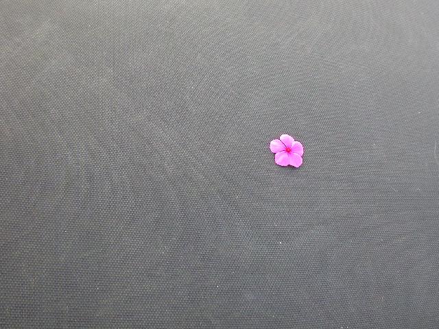
Cool picture! I love that the only color on the grey ground is the flower. There seems to be some noise in the picture that may be the texture of the neg space, but there is a strange pattern showing up here. I'd like this better if the subject took up a little more space here. Still good use of neg space and nice subject. I hope my personal critique helps and not hurts. :-) Good luck in the challenge! Grayce aka Gracious
Clever use of negative space and (almost) rule of thirds! I like the ' mainly "greyscale" with single color point of interest' effect too. Nice texture on the neg space.
the negative here isnt doing anything for the positive (dont feel bad, mine isnt either) i do like the swirls though. I think a bigger flower wouldve been better....4
I really like this idea. The pink against the gray really stands out. A good example of negative space, IMO. I do find the texture of the gray to be a bit distracting from the overall picture however.
Not much I can say abou this photo. I like it. I think the neg. space stands out and is very clear here. the subject is pretty, and also stands out perfectly. The angle and framing are good. lighting is perfect. the focus and clarity are also very nice. overall good photo. good luck in the challenge. ~Hbunch7187~
Im not fond of the Moire pattern here. I'd prefer the flower in the bottom left (so that it faces into the frame). Also, check out the 'Rule of thirds', theres no reason to break it here.
When this picture was just the thumbnail I that the flower was floating on water. Now I don't know what it's on. The flower looks like the colors are bleeding a little. 5





 Add photograph to your favorites
 Add photographer to your favorites


