Author Thread Comments Made During the Challenge
Post actions
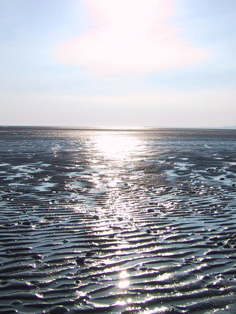
A bit blown out. Tough to isolate the actual subject here.
Post actions
Nice effect. I think cropping it so that there was more sky and less foreground might have made for nice pic as well. karmat
Post actions
This has potential but lacks a focal point, or subject. Good luck in the challenge. Grayce aka Gracious
Post actions
Its a nice pic, I do not think it contains much in the way of negative space
Post actions
Post actions
The sky is so bright you can't really see the clouds. If you had more time maybe this shot would have looked alot different another time of the day.
Post actions
Very beautiful, although in my opinion a bit over-exposed; also, which part did you intend as negative space?
Post actions
Love the sand and water. Sky seems boring in comparison. I wonder if you could just crop to landscape and include sand only from bottom half of photo? The black shadows could be the neg space and really WOW!
Post actions
Post actions
That doesn't look too much fun to walk on. The sun is kinda overexposing the upper part of the picture. I don't like that reddish cloud that much. 4
Post actions
Composition: 5
Post actions
Funny thing about your pic is the glare. This usually is a no-no, but I think in your pic it adds to its beauty. I'll give you a 9.
Post actions
Post actions
Post actions
I realy like the way the light plays off the water/sand (mud?) in this image... Here's a note of interest... 1 - I believe your horizon is a bit too close to center here... In this particular image, *I* would have made the ineteresting detail on the lower portion of my frame a larger part of the image. 2 - the horizon is not level. I minor rotation would have leveled this up nicely... good shot :) - jmsetzler
Post actions
Light (sun) is a bit too harsh for my liking. This meets the challenge well. Score 6 Justine
Post actions
lovely colours in the cloud formation--very appealing--andrewm
Post actions
I can see where the negative space is meant to be.. it's still just a bit distracting.
Post actions





 Add photograph to your favorites
 Add photographer to your favorites


