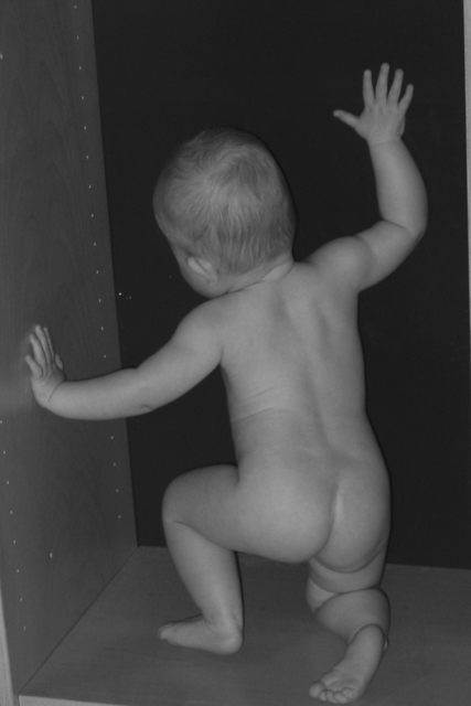
This is very cute, good subject, wonderful model, meets challenge, good composition. I do think it could be improved though, by lightening and a little more contrast. All in all, good job! Good luck in the challenge! Grayce aka Gracious
future mime? (sorry, couldn't resist) I think a little more light, and a shade more contrast would ahve helped this image have more zing -- it would stand out more i think because the colors wouldn't be so muted.
Very good use of negative space, mainly because of the framing. This baby looks precisely as the title suggests, and the background clamps in with strong polygons. Effectively claustrophobic! I would like to see a broader contrast range in the baby. 8
The shape of the body itself is very interesting and therefore creates interesting space around it. Nitpicks: focus is a bit soft - doesn't bother me, but does make me notice. Also, I think I might like it better if you cropped out the visible corner of the closet at the lower left and the slight bit of the frame in the upper right. Might have been hard to do and still meet dpc standards, I realize. Good shot. Take what you can use; disregard the rest. 8, just-married
Am I looking inside something from the backside, i.e., negative space? Cute. The picture is a smidgeon dark....did you try to brighten it at all? Anyway, I like it.
I'd like this more if there were no box in it. Just the child in that same position with the black background. Perhaps taking it from exactly front on to the box would give that? As it stands the box feels like a secondary object and part of the positive space, rather than negative. Sort of semipostiveseminegative! 5, Kavey
This is a great pose. Try to be aware of the edges of your picture. This probably would have been better if we could see more of the box. This picture doesn't really do a good job of illustrating negative space.
Good photo. I am unsure of how well it actually fits the challenge (it is rather vague, the challenge). A little boost in luminance and a boost to contrast would help.
Looks like it would have been near impossible to avoid, but if you could have taken out the bottom left corner where the edge of the shelf (?) shows it would have completed the feeling of being boxed in better. And the top right. I would have been seriously considering a 9 or a 10 with those two aspects removed. Agamemnon --8






 Add photograph to your favorites
 Add photographer to your favorites


