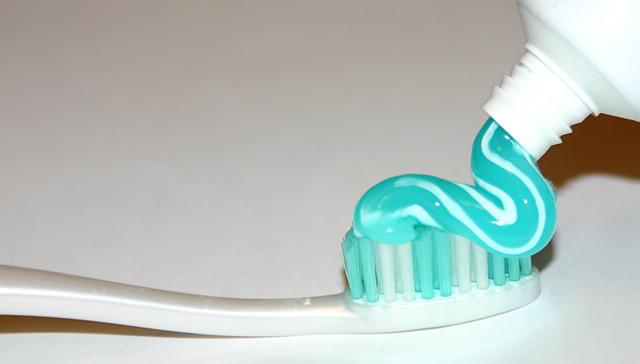
They certainly go together, at least 3 times a day in my life! This is a great idea but I think it would work better if the light wasn't so bright, the bottom of the toothbrush blends in so much with the bottom of the picture and the while it's nice that the toothpaste and bristles are almost the same color a bit of contrast might be better for this shot. Also the neck of the tube is almost blinding on my monitor which has been calibrated, the threads are lost on the center part of it.
The bright spot right below the toothbrush in the frame is quite distracting. Its subtle, but for some reason I can't look past it. I think the idea is good and all, but maybe with the toothbrush a little higher in the frame it would conceal the bright spot a little better. It could also make it worse I guess.
Excellent leading lines and composition here. I wish you had used another colored toothbrush (the bristles) or toothpaste as I would have liiked to have seen some color contrast between the two. In addition, the lighting is too harsh and you've lost detail in parts of the image.
shadows are harsh and the bright areas over exposed. you might try using a bounce flash to soften the lighting or make a softbox to get subtler light drop off.
The lighting here seems a little harsh, too bright on the right hand side. The idea is great, I really like how the bristles are the same colour as the tooth paste.
You could have used the clone tool to remove the glare on the toothpaste. 7






 Add photograph to your favorites
 Add photographer to your favorites


 Photographer found comment helpful.


