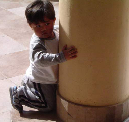
The image seems very soft / out of focus. The whites on the back of the boy's shirt are burnt out. I like the formal elements of the image, but they are weekend by a few things. The boys head is cropped RIGHT where it meets the top of the image. This is a no no and creates tension and makes my eye leave the picture. It should be cropped (IMO) either further down or farther up. From the angle you took it, it would be hard to get the pillar vertical and the boy still looking natural but i think it would be worth a try. I KNOW pillars are vertical.. and it 'doest really work' to have them on a 'slight' slant ... but good eye for something interesting..and good luck further. I DID like the image, despite the problems i had with it.. and remember these are just MY thoughts... not everyones.
Interesting shot, though it is really hard to compensate for a shadow cast from direct sunlight. I'd like to read your approach to the challenge when the voting period is over.
I guess I'm confused as to how this is considered Garage Art. In my opinion, that would be art...created in the garage. This doesn't appear to be anything that would normally be found in the garage (I hope) and it doesn't appear to be IN a garage. The shot is cute...sure, but just not right for this challenge.
As for the photo itself (trying to be helpful here) I think the face of the boy is too blurry, needs more focus, and I don't like the shadow on the boys face.





 Add photograph to your favorites
 Add photographer to your favorites


