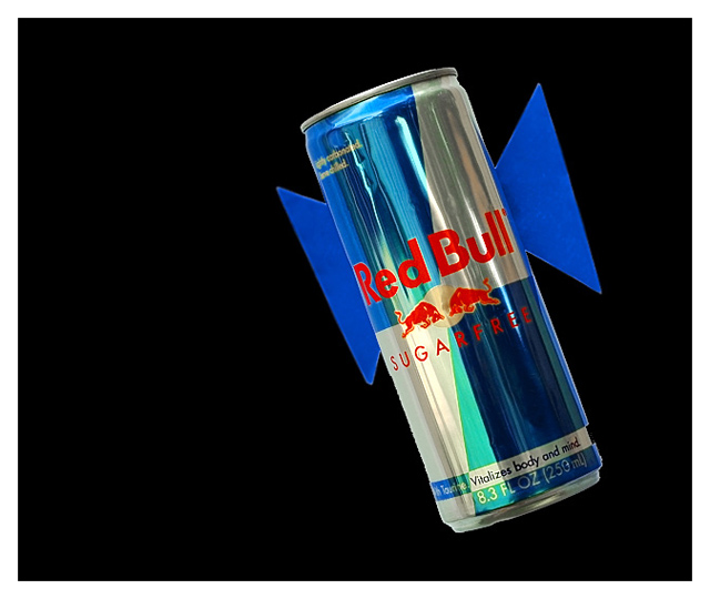
I like the exposure on the can but the "wings" are a little hard to interpret as what you intended. I agree with the comment Art left...the wings need to be more convincing, more obvious. Having a realistic sky behind the can would help give the sensation of flight much better than the black void represented here. Perhaps rotating the can so that it somehow resembled the back and belly of a bird (or anything else that is generally airborne) and tilting it further within the frame would provide a bit of energy to the image?
The technicals seem fine. The lighting on the surface of the can is well handled and play of tone and color in that portion of the image is by far the most interesting thing. I think, however, that the lighting on the wings (the purported subject of the challenge?) is flat...it would be more dramatic if the wings were made of a similar material to the can...or something entirely different, like fur or feathers.
Overall, this strikes me as an image made only for the challenge. It has little to offer outside of that context. I'm only vaguely familiar with the product, so reading the can becomes a necessity for figuring out the reason for the image. It's noble to think outside the box...but I also think that trying to figure out the DPC voters will do little to advance your art.
Not expecting much, just seeing how overall site accepts.
Glad your expectations were not overestimated. ;-) Really I don't think the idea was bad, but to pull off a good finish with a concept like that, you have to make it pop and it has to be relatively flawless. Realistic wings and the can against a real sky maybe. Tough one to pull of but don't give up on thinking outside the box. I'm glad to see something other than a fairy, hummingbird or dragonfly. :)
I take it this is an advertising slogan? I suspect thatthis is one of those photos that very definitely needs to be placed in its cultural context to work properly. The photo itself appears well and evenly lit, although the composition does seem a little awkward.





 Add photograph to your favorites
 Add photographer to your favorites


 Photographer found comment helpful.


