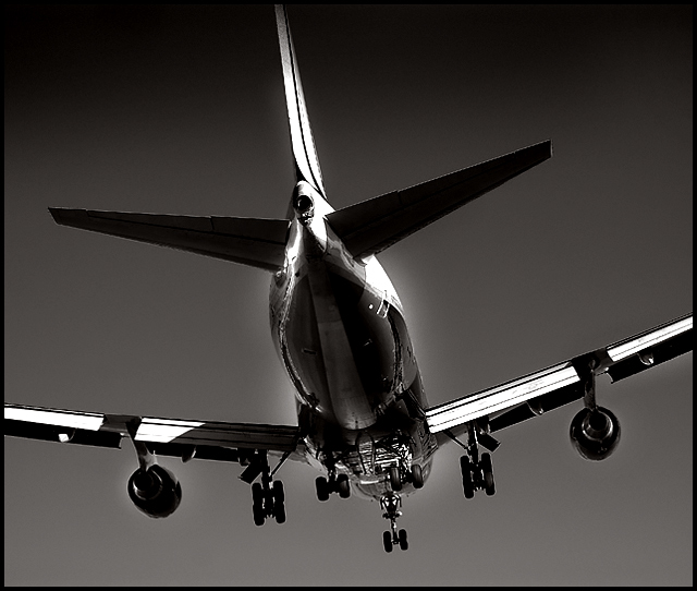
First impression: good graphic impact! I like the tones...feels like a traditional black and white. The sky is odd...over-polarized?
Having read your comments I must agree with those who dislike the glow around the jet...it looks like a result of post-processing. It's very evident and doesn't seem to have an interpretation to it...it won't pass for water vapor. The jaggies are also clearly evident and take away from the smoothness of the metallic body.
The composition is probably the strongest element here. The timing of the shot, with the landing gear down, takes this a notch above the standard plane shot. I like the interpretation of the subject and agree with the comment that B&W is a satisfying choice.
Overall, it could be a cleaner image but the graphic impact helps make a statement of power and beauty. You predicted your score well...so what can I tell you except "Nicely done."
I like it. The stark processing gives it a very surreal appearance, almost like a scene out of Matrix. I'm sure you'll get loads of criticism about the haloing but screw the naysayers, this is a GREAT shot. One niggle, there appear to be resizing artifacts on the straight lines of the wings and tail. Otherwise, flawless.





 Add photograph to your favorites
 Add photographer to your favorites

 Photographer found comment helpful.


