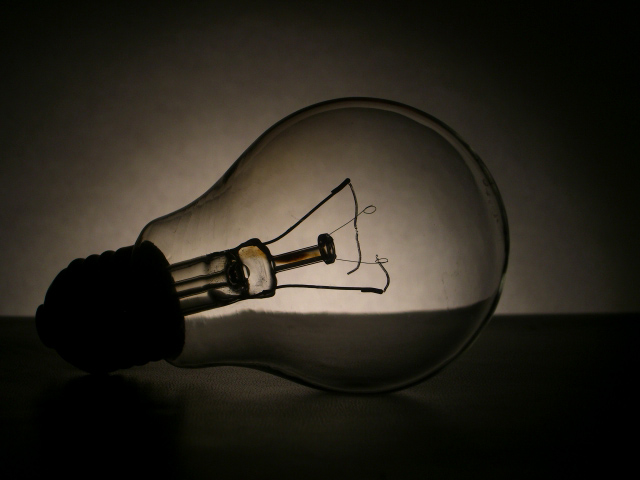
I think this is quite classic ... a little more to the left side would have taken it off the centred feeling ... like the height of the table on the thirds line.
I like the subtle message and the low key look. Only nitpick is the position of the line in the background. Perhaps a lower angle to make that line lower in the horizon, would've been less distracting.







 Add photograph to your favorites
 Add photographer to your favorites


 Photographer found comment helpful.


