The image size is a bit small. Your lighting is off, too bright on the left side, bordering on getting dark on the right side, and there is too much shadow. Your subject has lost a lot of detail.
The idea, and title, is good. The image is a little small and the focus on the items is slightly blurry. Tthe light from the upper left is a little too strong and has caused some hot spots, which also makes the darker fringe on the right more noticable.
Good subject but picture is small I am sure someone has said something about resizing your pics, I had to learn all that the hard way got voted low for pics that were good but size too small,,,,,, if you need help resizing use the tutorials that are in learn,,,,, make your picture 640 on long side and 480 on short.........it does make a big difference I know I was very greatfull for someone telling me........
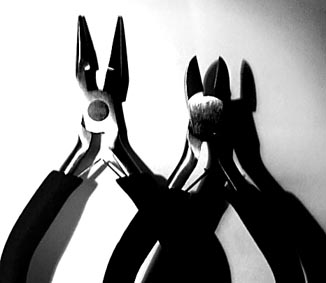
Nice idea and composition, I feel that the lighting is a little bit harsh and the shot overexposed. The shadow on the figure of the right is distracting.





 Add photograph to your favorites
 Add photographer to your favorites


