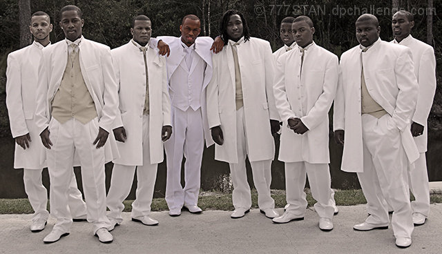
An interesting collection of men. Their similar dress makes their postures and expressions more evident allowing the viewer to see their unique expressions and individuality.
I like the sepia toning in the majority of the image. Clearly you felt the need to make the groom stand out, and he does, but not in a good way. The difference in his complexion from the others just seems weird. I think his central position and difference of stance are enough to identify him as the main figure in this group.
It does look a lot like a shot of a musical group...I like the casual feel of this posed image. But as a posed image it seems that some better choices could have been made. The lighting is harsh leading to squinted eyes and uncomfortable expressions...especially on the man at the far right. The 3rd man from the right partially obscures the 4th...this merger weakens the whole. Large groups are difficult to get everything right, granted. So more shots to get a decent expression on everyone, eyes and faces generally in tune with the camera (not closed or looking out of frame), and avoiding awkward overlapping.
The background is relatively neutral, but the reflections off the water are not helpful and the concrete not so interesting. Compositionally, I think the frame is a bit tight at the top...a little more head room would help bring the faces more into the frame. The way this is cropped the outfits become the pattern feature...and that's interesting...but I think there is more interest to be found in the faces which are crowding toward the top of the frame.
As for the challenge, I rarely care when making these critiques but not being familiar with the term "wingmen" I have to agree with the comment that it would have made a better title in helping connect with the challenge topic. Otherwise, it just feels like a shoe-in.
This looks like a photo for a musical group. I understand that you were trying to highlight the groom, but something seems off with the desat - not very complementary to the groomsmen. I'd have left it in color because I bet this is a really good pic that stands out on its own.
Just simply doing "Wingmen" for the title would have appealed to me more. The capture itself is okay, but the environment doesn't do the scenario justice, IMHO...
This is a cool image. I would have not cropped it so closely, to keep their faces closer toward the center of the image. Their expressions are the story here, otherwise this looks like an ad for tuxedo rental, because the white is what stands out. I'm not sure that I would have desaturated the other faces. Lastly, it's a bit tilted...






 Add photograph to your favorites
 Add photographer to your favorites

 Photographer found comment helpful.


