|
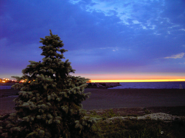
I like the fact that you have included a foreground object for interest, but it looks kinda creapy to me :) For some reason on my monitor the red horizon just doesn't look right...also the mixture of warm tones at the horizon and cool tones in the clouds is awkward. he lights behind the tree are a little distracting and the can? on the front right too. I guess overall the distractions don't fit solitude for me, but remember that is just one person's opinion here and doesn't mean the photo is bad. I'm sure there are just as many folks that love it.... |






 Add photograph to your favorites
 Add photographer to your favorites


 Photographer found comment helpful.
