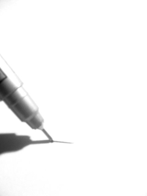
This is a neat effect, and works well with the white background of dpc, but i think the pen needs to be a little sharper (just my personal taste). I think the pen sharply focused with high contrast would have a neat effect. karmat
idea and compo are great but poor focus lets it down. if your macro capability isnt up to snuff try putting a magnifying glass in front of your lens. mag99
Being a writer/ artist this hits me on a personal level. I love the feel of a fresh piece of paper and an excellent writing utensil (I can tell that is a Uniball fine point, right?).
Nice image, though a bit soft. If after a grainy appearance, you might try bumping up the ISO to 400 or higher (if your camera supports it) and use a neutral density filter to keep the exposure within the camera's capabilities.
I understand that the lack of focus is probably a design element, but it doesn't work for me. Which is a shame because my instinct tells me I would have scored it an 8 had the focus been sharp. 6 Jak.
Great work I like the soft focus - and yet it still has a lot of detail. Yes, the Neg Space makes a difference and adds to the subject and the effect of the photo. The Neg Space REALLY draws your attention right to the pen. Technically great work. Great composition. The placement here is perfect - as not being all the way in the corner (although, As I look at this, I wonder, does the person writing with this pen hold it at the end of the pen? -just a thought I had) So, it's great, makes a person think. Great Work 10 Ruthann (updated)
Good creative idea. I don't think the 'blur' adds to this shot at all, would of liked to see that left off. Still it's right on target for the challenge. Nice job. Scroe 6 Justine
This is really a great idea and the composition is also great... My mind is begging for stronger focus on this pen, but somehow the softness of it still is quite gripping in some strange way... good work :) = 8 - jmsetzler
This is one of the best uses if neg. space I have seen here. The white background is appropriate (and hence makes the photo work well). Perhpaps the pen is a little too out of fcus for my liking, was the focus intentional? I like the shadow. Scores highly for use of neg. space, loses a little because of focus. Excellent work overall!






 Add photograph to your favorites
 Add photographer to your favorites


 Photographer found comment helpful.


