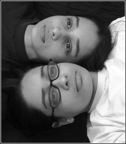
I haven't been a big fan of twin photos like this thus far, but I say you've broken that mold. The setup isn't too original, but the shadows and light really take it somewhere. The shades don't blend with each other, they stand out and give each element a distinctive precense within the photo.
I like it! Even lighting, and no glare on the glasses. I'm betting some folks may say to lose the glasses, but I think they work. Might have also been interesting to have the top half of the background white.
Interesting idea; I think I would have worked on more similarity in the faces by removing the glasses. Also, the black and white tops add a nice contrast, but the black top blends into the background so it doesn't give a good contrast effect. Actually, since it blends so well, it might have been cool if they both had black tops, leaving just the two heads. Then you might consider rotating it so one is upside down and the other is right-side up. As you can see, I think you are onto something good here, and while you may be satisfied with this nice shot as is, there's some other areas to explore!
Decent composition and lighting - seems a little flat - might be the reduced size of the photo for this site. Is it clearer and with more depth in the original? There are many distractions - perhaps intentional - but distractions nonetheless. My eye tends to jump around the image and does not land on a satisfactory focal point or points. Might not be the best way of explaing it.
I don't think Gemini Twins had identity complexes which led then to differentiate themselves with rings and glasses. But that's what I like about this picture.






 Add photograph to your favorites
 Add photographer to your favorites


 Photographer found comment helpful.


