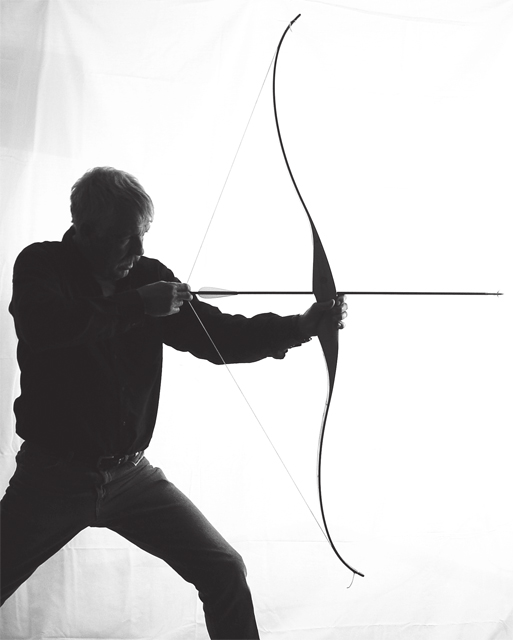
I can't really put my finger on it, but something looks wrong about that bow. It almost looks like it is strung on the wrong side. The stance is unnatural and there is very little power put into the bow. I like the B&W treatment.
This almost worked very well. I am sure many others will comment on the same thing
"Care of your background"
The creases and particularly the line above the archers right shoulder ruin a potentially great shot. It looks, unfortunately like a "hanging sheet"
The graduation of light is nice - the semi-silhouette is great - the composition is great -
JUST THE BACKGROUND.
David
I'd prefer this to be either a true silhouette or to have fill in light that allows me to see the detail of the subject. This feels like it's randomly stuck in between the two. Pose and composition are OK, but lighting is the main problem for me.
The position of the model not very dramatic, think more outstreching would be better. Also the model is a litle gray. More contrast or maby some other kind of lightning would have been better.
Very nice idea and composition. I think this would have been better if you had gone for even higher contrast, so the person was even more a sillouette, and the details on the background on the left were more obscured (that might have taken a fill light though, in addition to the higher contrast).
Neat shot. You really did well.I can't help but wonder how this would of looked if we saw less on the left side and had moved in a bit. I realized you were trying to include all of him but the white to the left pops out. Still its done well and I hope you do well in the challenge.
Nice shot, a full arm extension would've added more to this shot. Sagittarius is strong and I don't feel the strength here. He looks like he is struggling with his bow.
This could have been really cool if you had increased the contrast quite a bit making the guy seems featureless.... interesting idea though. Good luck.






 Add photograph to your favorites
 Add photographer to your favorites


 Photographer found comment helpful.


