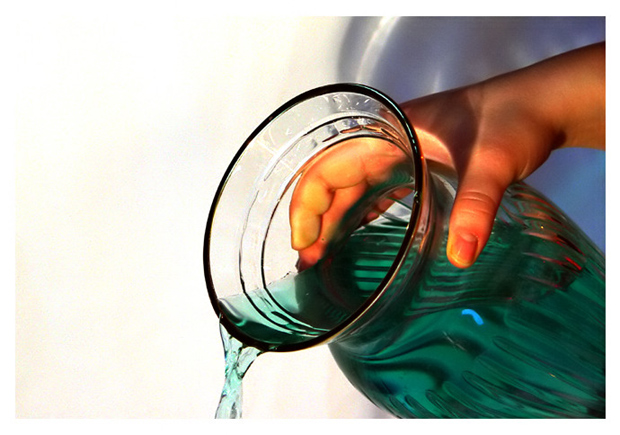
great use of the colors green, blue & white...they go very well together and blend very well. Also like the white border you have. Great idea to color the water too.......10
Don't drink the green water!
Joking apart I think it would have improved it if you had clear water and a green vase. Mainly because if you look carefully at where the hand is gripping the vase it has flattened and sqashed the forefinger making it look uncomfortable. As it is so bright compared to its surrounding it also makes it obvious and distracting.
The blue highlight on the vase looks distracting -. I pulled it into photoshop and did some adjusting - replicating only what you could do in camera or with background - this is what I did
Got rid of the blue background on the right - creating an even background - that immediately too a little of the ptressure off the fingers. changed the blue highlight to white and darkened down the fingers. Finally changed the clear glass green and the water white.
Left the composition exactly the same and I feel it changed it from a photo to A picture.
David
Very good photo. the green gives it color, and makes it easiier to see. But not really the color of water. I hope its not voted down too much for that.
The color fo the water and the hand and the quality of the light are wonderful. That shadow is distracting though. Maybe a bit less white on the left, 7
The skin tone on this shot seems to be off: too orange. What seems to be the kitche sink in the background is also a bit distracting. The upper right corner is quite blown out. Good idea of using coloured water to give this shot mor impact.






 Add photograph to your favorites
 Add photographer to your favorites


 Photographer found comment helpful.


