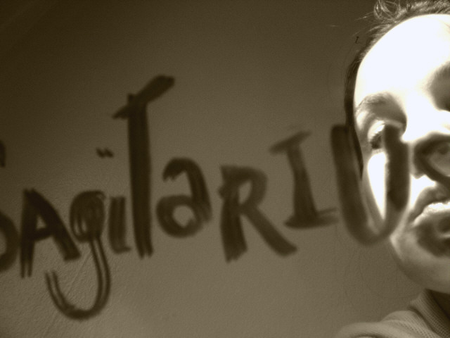
Nice idea. The light appears to be a little strong on the person in the image, though. If she's toned down, you'll draw more attention to the writing. Seems a bit distracting.
The colors portray a strong emotion, but (being picky) the face is lit up a little too much and contrasts too much with the rest of the picture. I think it should be the focal point, but not as much light. Good luck!
Lighting is too harsh and the wall behind isn't too attractive but the image does draw me in for a second look. Other than the fact that the text spells out a zodiac sign I am not sure what the idea is here - is there meaning in someone writing this on a mirror? Not sure.






 Add photograph to your favorites
 Add photographer to your favorites


 Photographer found comment helpful.


