Wow amazing photo!
a big 10 no doubt about that
this has to be in one of the top places looking forward to seing your pictures in the futer
Luv Mundi Pretty
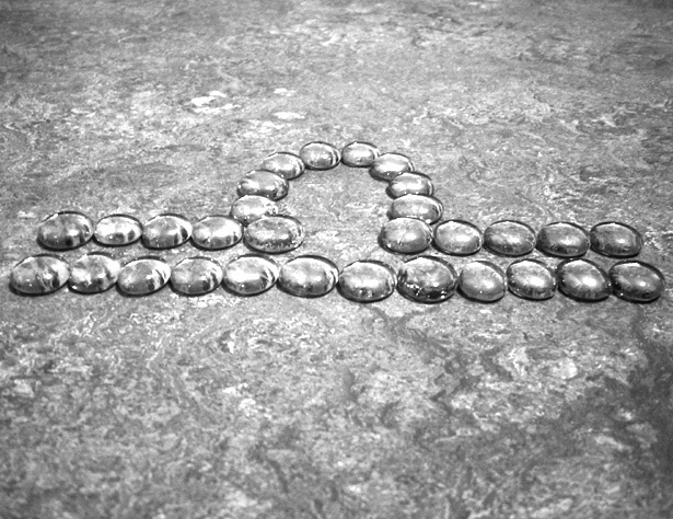
interesting to hve the subject seem so like the background and yet it stands out, Are these clear glass pieces? You have chosen a horizontal composition, and yet the libra symbol is slightly tilted. It would be better with an obvious tilt, or esactly plumb. I'd crop on the top - having more space below the sign implies the weighing of objects unseen, and having th imbalance in the composition invites your eye to wander more.
I like this.....I just wish there would have been more contrast between the subject and the background.....just seems to blend in too much together......too gray and flat....just my opinion!





 Add photograph to your favorites
 Add photographer to your favorites


 Photographer found comment helpful.


