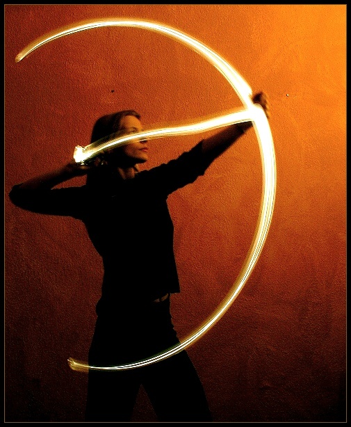
This is a long time exposure shot (10 sec.). Approx. 7 seconds we've painted the bow by using a usual bicycle lamp. During that time the room was absolutely dark. For the remaining exposure time I switched on a lamp in the upper right corner, asking Susi not to breathe. This is one of approx. 50 attempts, it was not easy to get this IMHO satisfying result. In the background you can see the wall of our living room, the two distracting dots are screws in the wall. I don't like them too, but spot editing wasn't allowed... ;-)
Statistics
Place: 1 out of 120 Avg (all users): 7.6572 Avg (commenters): 8.6000 Avg (participants): 7.6395 Avg (non-participants): 7.6650 Views since voting: 11905 Votes: 283 Comments: 88 Favorites: 106 (view)
I congratulate you to this great photograph my brother! I like special lighting tricks very much and this is clever idea. I think this photo really is one of your best!
I think this is my first time I have said "YESS! she won" for a picture that I didn't made. ewery thing about here is perfect.... thoug she is litle shaky and dark, IMO that is what make the picture so good: Well done!
I think it's just perfect as is. The mood is fantastic, the concept wonderful and beautifully executed, the image is stellar. I personally don't like photographs to be 'fixed' too much - the spots on the wall add to the texture of the shot, why remove them? Anyway, congratulations on your blue ribbon. :)
I’m very proud of this, because I got the last blue ribbon only by a „cheap trick“ ;-). If there are any questions left after reading the photo details, please feel free to ask me...
Regarding to your comments: Yes, you are right, this shot is techically not as perfect as it could have been. Susi is a little bit out of focus, because of the long time exposure. A flashlight probably would have minimized the blurred parts of this shot. But in this special case I prefer the warm and softer touch of a diffuse lighting by a lamp. If you want to have a look at a spot-edited version without the two distracting dots in the background, please visit my homepage.
Special thanks to my GF Susi for her incredible patience and for „setting my heart on fire“! By the way: Her zodiac sign is Leo, but this was much too difficult to paint with a bike-lamp... :-)
This is really great- I'd even think about *not* spot-editing those two screws in the wall. The more I look at it, the more I want to accomodate the screws into the image since it looks so enticing. They're like the moon and stars.
Wow, what a nice image! The composition is great, and I like the background color and the way it shades into darkness. I think this would have done well in the "painting with light" challenge too. Very well done!
This isn't the best taken photo of the challenge. It may however be the coolest. Your idea is incredible. Very well thought out. If only the arrow could've been straighter. Well framed and the lighting is pretty good too. Excellent creative idea. good luck 8
A nice original representation of the archer. It is a shame the subject is stood quite so close to the background - The 2 marks on the bacground are a little distracting.
Neat arc of light for the bow. Model has moved during the exposure though, so it loses that sense of perfection necessary for such a concept. Nice texture and lighting.
Nice light painting! The only thing I would have changed is the background. I would like to see more red in it and more separation from the subject. Well done.
Great Picture! Very creative! Awesome light effect. Could have done well in Painting with Light challenge too. My favorites in this challenge! Should win 1st Place!
Excellent work - unique, stylish, fiery mood, beautiful. Those two specks on the upper background and blurred left hand might be seen as imperfections, but I wouldn't change this photo at all. If you blew it up, does it stay clear (high-res)? You should win, so I'm giving you my top score for the week.
I like this photo.....could have been entered in either current challenge! I like the light movement and the background is nicely lit too.....great, creative effort....high marks from me.....10!
This is really one of my favorites, quite a lot of thought and imagination put into this. I love the background choice in contrast to the black clothing, great lighting as well. And as for the bow, well, spectacular! They way you got it to go from narrow on the ends to wider in the middle, nice touch! Too bad no spot editing allowed, I'd get rid of those two dots on the wall, doesn't that just drive you mad sometimes? :) 9 from me!
wonderful use of light. I am interested to see your comments after the challenge and learn exactly how you did this. Compelling composition, lovely background. 9
Absolutely beautiful. I love the natural gradient in the background, the thickness of the arc, the perfect shape of it. All around stunning and wonderfully executed.
This is really intersting. I'll be intersted to read your photographer's comments to find out how you did this one. it's really unique. I like the colours - red light, etc.
Unique and excellent photo. Nice colors, shading, and contrast. The bow hand is a little out of focus, and the string hand should be on her cheek, but those are minor.
Excellent idea! Your title bugs me though since you seem to be referring to Cupid, and not Sagitarrius. Too bad about those two spots on the wall, but I understand that classical rules were in place for this shot. Too bad that the "arrow light" is so high on her face. I would have preferred it at chin level or a little lower. Love the background colour
That is amazing. And its not JUST a neat effect - you have some very nice, dramatic lighting and interesting backdrop. Overall, the concept and execution is great. A couple of specs and what looks like oversharpening keep this from getting a 10 from me, though. A solid 9 for sure.
Interestingly done... I'm curious to find out how you did this, I'm guessing that you had all the lights of set your camera on b, she drew her bow and arrow and then you popped the flas from up and above her on the right. anyway, great photo! I love the fact that it is brighter in the upper right hand corner as if there is fire there... and nice choice of her wearing black. The background really adds to this. I'm going to give it a 10. Good luck!





 Setting A Heart On Fire
 Add photograph to your favorites
 Add photographer to your favorites

 Photographer found comment helpful.


