Thanks for all the comments, I agree with the lightings comments, it is harsh. I wasn't very satisfied myself but wanted to submit my first pic altough I didn't have much time to make something :-)
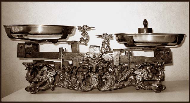
The subject is interesting, but I think you could have tried a more interesting perspective to improve the photo, its just too ordinary right now. The lighting is a little harsh especially in the background which is blown out in the center. The two edges on the left, and the wall are a little distracting.
Great scales, stronger rating if you macro on the scales to capture ornate emblems and character. Don't take shot of the whole thing since we would know by your macro enough that it is a scale.
Well done, fits the Challenge great! I am a Libra...those scales are very nice looking are they old...? the only thing I would have changed would be the edge of the Table is a bit out of place. But that is just me....I give you a 10
Nice set of scales and I think the choice of black and white with toning brings out the detail. Lighting is somewhat uneven, perhaps softening it by putting a sheet or tissue infront of the light source might help. I'd also consider using a large sheet of card, curved to provide both surface and backdrop, to remove lines and remove background detail more effectively.
Interesting subject - lighting is strong in the center, and in some of the reflections. Undoubtedly, some detail has been lost in the size reduction, and that hurts this pic a bit.






 Add photograph to your favorites
 Add photographer to your favorites


 Photographer found comment helpful.


