This is my first submision... I saw this challange, and figured, what better way to start than with something I have a lot of!
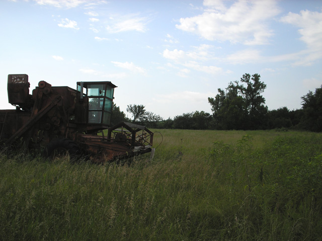
All I did for edit was a 10 point brighten and a resize, figured that was enough.
It's an old combine we have sitting as yard art by the driveway, it's finally being put to use again!
Statistics
Place: 264 out of 290 Avg (all users): 4.5071 Avg (commenters): 4.1250 Avg (participants): 4.2571 Avg (non-participants): 4.6312 Views since voting: 884 Views during voting: 262 Votes: 211 Comments: 8 Favorites: 0
Nice composition, but the land is too dark, and the sky is too bright. Use of "Curves" in a tool like PhotoShop or Paint.net (free) could have lightened up the mid and dark tones (the land) while darkening the light times (sky) at the same time...resulting in more ballanced lighting in the picture. //www.cambridgeincolour.com/tutorials/photoshop-curves.htm
The foreground seems a little dark and flat to me. The equipment is interesting, but not much else in your photo holds my attention. I like the sky though.
It needs to be brightened up and the straw-chopper got chopped off of the combine. Other than not being a John Deere this is almost like one I used to drive on my dad's farm while in high school.
Unfortunately, the ground is too dark and you can't see the combine very well. This would have turned out better in advanced editing where you could brighten the ground without blowing out the sky. Not much you can do in basic editing. But it's a good composition with an interesting subject.
good solid concept - placing the combine in veiw with the field behind. however, the sky is a bit blown out, the ground and combine in front are a little dark and horizion is too centered.





 Add photograph to your favorites
 Add photographer to your favorites


