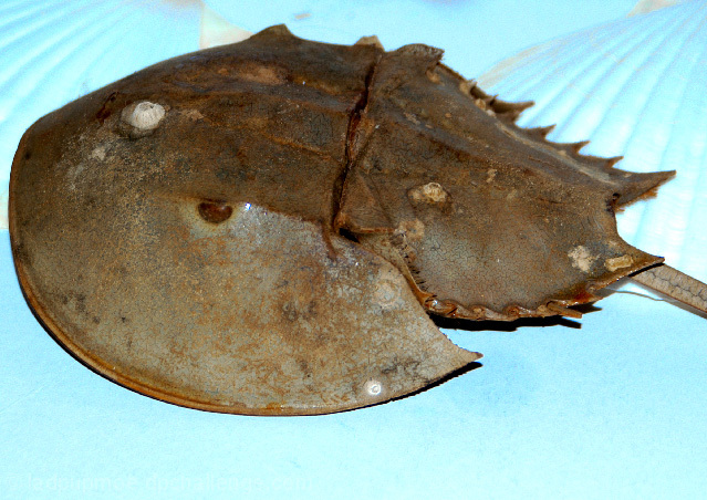
Sharp detail, but the angle on this doesn't really provide anything engaging for the viewer. The background almost looks textured, but simply remains confusing and detracts from the subject.
Given that the challenge is to represent one of the signs of the zodiac my feeling is that traditional crabs, that are closer to the most commonly seen image of the Cancer sign, would be better used here.
In terms of the image itself I think that the frame feels crowded - the crop is very close to the edge of the subject - it feels too close to me. The colour of the background doesn't appeal to me and the fanned out stripes toward both top corners are a little distracting - they don't add anything.
I have always loved the Horseshoe crabs, highlight of a trip to Duxbury beach, but I do wish that the tail hadn't been cut off. The background is probelematic for me as well, I guess that you were trying for ocean colors and ripples but it is distracting and draws the eye in an unfortunate way.
Critique:
That being said, the fact that the angle is uninteresting, the lighting is a flat, on camera flash and the background is screaming at me doesn't do the crab justice. That is why I'm giving you a 2.
Suggestion:
A nice soft light from the right, the crab facing the camera (not square on, but not facing AWAY like it is now). A white something for the crab to be sitting on while casting a soft shadow showing the horns near the eyes...shadows of the spines falling on the white background. That's probably how I would have shot this fanastic subject, but of course this is my opinion, so take it for what it is.
I haven't seen one of these in years. As a kid in NJ we used to play with these odd creatures. Thanks for the memory. Not a bad shot but it is the wrong 'crab'. :)







 Add photograph to your favorites
 Add photographer to your favorites


 Photographer found comment helpful.


