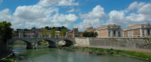
Just back from vacation in Italy. Searched through the 1000 or so shots I took for something that fit this weeks subject. This one seemed to fit. It is a different take on "Urban".
This was taken from the "Bridge of Castle St. Angelo" in Rome, the dome in the shot is St. Peters Basilica in the Vatican. The bridge itself was impressive, built in 239 AD, it is lined with marble statues, the many shots of the bridge and castle itself where beautiful, but did not fit the category.
Shot taken wide angle (18mm), cropped to give it a panorama-landscape effect. Color adjustment and low sharpening applied post-production with Nikon PictureProject.
Statistics
Place: 57 out of 176 Avg (all users): 5.9455 Avg (commenters): 6.7778 Avg (participants): 5.7500 Avg (non-participants): 6.0282 Views since voting: 1300 Views during voting: 262 Votes: 202 Comments: 12 Favorites: 0
This could use a quick touchup of levels and/or curves. Nothing's really black and nothing is white. I would include more of the building on the righr as well. Otherwise I like the composition and the colors are quite nice.
Thanks for the "Curves" recomendation. I never realy knew what "Curves" where, but after looking up a few "Curves" tutorials online...I can't beleive I'd not used them before. The ability to adjust low, med, and high tones independantly is amaizing. I re-edited this scene with curves...it was sooo much better! This is something I will certanly use in the future (already have on this weeks entry).
I agree I the composition would have been better if the building on the right was not cut-off...unfortunatly that is how it was captured. Maybe I should have cropped at the edge of the first building on the right...but I would have lost the panoramic effect. But it would have corrected the smallness pointed out by Smardaz...it looked great at 100%, but I agree the details are small at 640 wide.
Thanks everybody for your comments. They where very helpful this time. :-)
WOOHOO! Went from my personal worst to my personal best back-to-back! :-) I think some of the comments on this entry is going to help me on future entries too. Thank you all! :-)
This could use a quick touchup of levels and/or curves. Nothing's really black and nothing is white. I would include more of the building on the righr as well. Otherwise I like the composition and the colors are quite nice.




 Add photograph to your favorites
 Add photographer to your favorites


 Photographer found comment helpful.


