Author Thread Comments Made During the Challenge
Post actions
Post actions
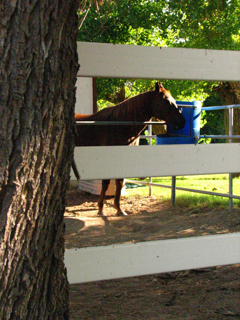
Shame about the lighting here, particularly that the horse's head is in such shadow.
Post actions
The horse is in shadows, the forehead is blown out. The tree and fence just feel like they are in the way.
Post actions
Lighting is not good, subject is in shadows
Post actions
ISO maybe a little too high on this one?
Post actions
Not enough shadow detail on the horse.
Post actions
For me, your photo is very busy with all the cross lines of the fence and the distraction of the half of tree. I do like the way the light hits the horse's nose and the trees in the background though.
Post actions
I find the noise very distracking
Post actions
the tree covers most of the image
Post actions
rural: yes. landscape: no. nice composition with the tree, fence and horse, but the horse itself is too dark, the blue thing distracts very much
Post actions
The composition using the fence and tree is nice, it's just too bad the shadows on the horses face are too dark.
Post actions
This photo is very grainy, which, in this case, I do not think adds to the image. A lot is also lost in the shadows, I'd like to see more detail there
Post actions
The main subject is out of focus and there's too much clutter in the foreground and background





 Add photograph to your favorites
 Add photographer to your favorites


