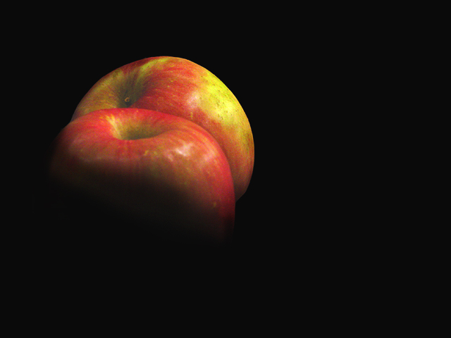
This was one of my favs from the PWL Challenge. The overall composition of the shot is very well done.
But the negative space on the right is a bit too much for my personal taste, the rule of thirds is not in play here and the shot looks almost cut in half. The light that was used is perfect for the apples but perhaps a third apple slightly to the right or a more frontal approach on the apples.
I really can't find anything that I don't like about the shot except the balance issue. It's well done, the light is very well done and the apples look very delicious as a result!
Good Luck In Future Challenges!
Deannda
DNeufer@stny.rr.com if you have any questions or want to discuss this further!
Unusually good shot of an often overdone (and badly done) subject. Possibly a little too much black on the left - I would be tempted to crop it but still keep the apples out of the middle.
Here is a comment I have put in some others which will explain my mark.
-----
My only concern is, as you may have guessed from the amount of discussion on the forum re "painting with light" is whether it is painting with light.
Having been lucky enough to judge what is now a few hundred competitions in the last 30 years I feel I should say the first thing that happens is that they are sorted and any that do not immediatly seem to fit the category are dumped (hard but a fact). This is why so many competitions also run an "open category". Your picture, as impressive as it is, would, I feel have been rejected at this stage. "Painting with Light" has a fairly tight definition in photography but still allows a lot of lattitude for creativity.
I suspect that your scores may not reflect what the picture is worth which is a great shame. I believe if I was judging in another category I would have marked higher.
I do hope you understand my reasons for marking it down
David
The apples seem like the moon hanging in the night sky. The effect works well. The apple seem a little gray or dusty - you'll think I'm crazy - perhaps the colors on the apple need more contrast because the contrast between the apple and the black is so great? I like the placement of the apples in the blackness too -





 Add photograph to your favorites
 Add photographer to your favorites

 Photographer found comment helpful.


