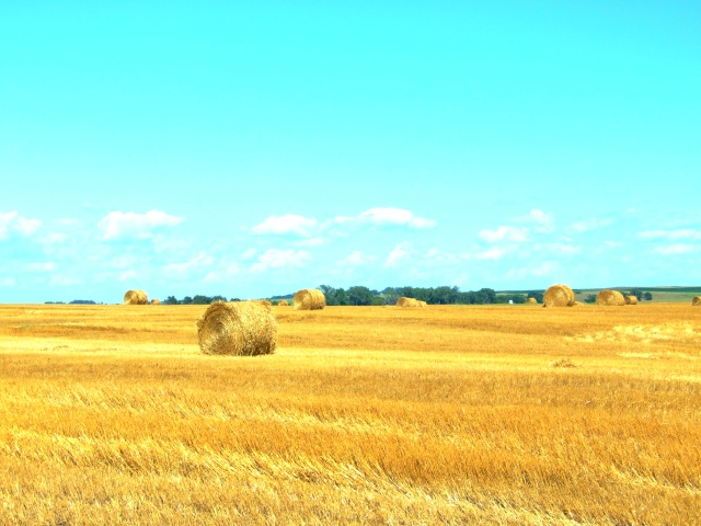
Nicely captures the feeling of this rural location. My initial reaction is that the amber waves are a bit to intense ... I might have reduced the yellow saturation a bit. Adding a bit of mid-tone contrast might have given this a bit more depth.
Nice scene, but straw is too saturated for my taste, and the sky color is off.
Split horizons usually aren't good, cropping off the top third of the sky would make the composition more interesting.
I feel like this "could" have been a really cool image, but the sky just completely blows it for me. That color is just not at all natural looking, and even as "artistic expression", it feels very harsh.






 Add photograph to your favorites
 Add photographer to your favorites


 Photographer found comment helpful.


