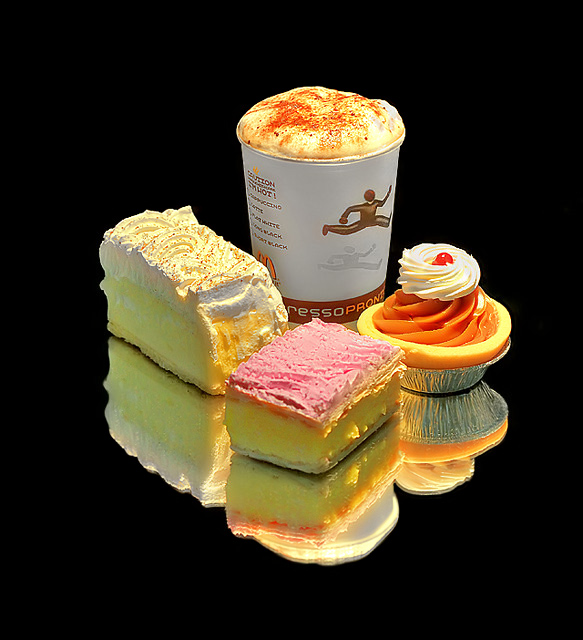
I don't have a McCafe near me so I had to make do. I bought the cakes from the Bakery and the Cappuccino from McDonalds. But trust me to get a trainee woman on the cash registers...and on a Sunday morning. Her Cappuccino was flat and below the top of the cup. I couldn't tell her that I needed it looking good for a photo in case I suddenly got the 'Copyright' spiel from McDonalds.
So instead, when I got home I used my Cappuccino maker and made up some thick froth and topped the cup up with water and put the froth and some more chocolate on top of the Cappuccino. I then laid the cakes around and had my son hold a light over the top of the display to give me the effect I wanted.
I hope it makes some mouths water...as we are sure going to enjoy desert tonight!!!
Statistics
Place: 11 out of 69 Avg (all users): 6.2825 Avg (commenters): 6.4091 Avg (participants): 6.1026 Avg (non-participants): 6.3207 Views since voting: 1525 Views during voting: 431 Votes: 223 Comments: 27 Favorites: 0
really nice shot. Great color, contrast, reflection. the double image created by the thick mirror at the bottom is a little distracting to me, but htis really has some punch.
beautiful colors, sharp and well lit. from a compositional poit of view: more attention to the reflections. their lines do not match up and form or continue other lines. There are too many gaps/overlaps/cuts in the reflection. And the reason for that? The originals are not lined up either. I don't see a continuation of the cup's lines downwards. The corners of both left pieces show a gap. The only half-way alignment I can spot is between the both right pieces. Here the yellow circle touches the pick surface and in the reflection the one corner alignes with the yellow circle again. But then the white cream is cut.
While this is an admirable try, you should read up on simple design principles and how to create strond impressions with simple forms.
I am not saying I mastered these principles - far from it. But visit my profile and on my first page the 5th picture of my high scores titled: starting with the basics, is a decent approach of these prinicples. It's still not strong enough to create a real impact, but try to study how I tried to apply lines, shapes, distances, reflections. There are stil many imperfections in my shot, but may be you can learn a little from it.
I'd like to encourage you to study this further. I could learn from you how you ackomplished the clear and single reflections. I seem to always get double reflections on glass or mirrors. May be you can tell me how you got these clear reflections. Thanks
really nice try
the only thing I would suggest different next time is to have the product on a white surface thats not so reflective so the the reflection is a little more subdued and softer
For me, your shot looks a little overly sharpened and the lighting is a little harsh, but I like your composition, the reflections and the black background. Point for meeting the challenge description as well. Good luck.





 Add photograph to your favorites
 Add photographer to your favorites

 Photographer found comment helpful.


