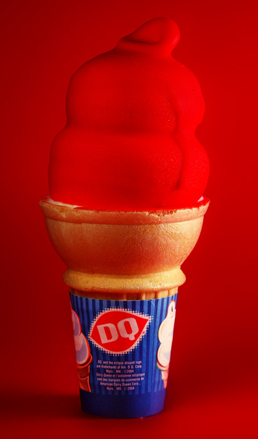
I hadn't done much product shooting, so this was good practice. Got a couple clamp lights with the same time of bulb, an 89 cent piece of posterboard, put some white T-shirts over the lights and darkened the room, and shot. Editing was curves, brightness/contrast, and gaussian blur on the background to smooth it out (including sensor dust). No spot editing on the cone except a masked shadow/highlights layer to brighten the paper a little.
Statistics
Place: 43 out of 69 Avg (all users): 5.1696 Avg (commenters): 4.6957 Avg (participants): 4.6667 Avg (non-participants): 5.2757 Views since voting: 1013 Views during voting: 364 Votes: 224 Comments: 25 Favorites: 0
Would have been more effective if the background weren't also red, or at least if it were a different red. As is, the cone just doesn't stand out enough.
The question is, how long did you have before the lights melted the subject? I am not a fan of the red on red though, it just blends in, instead of putting all the focus on the subject.
This is a great idea in general. But it misses the boat in one crucial way. The cherry against the red background. Try it again sometime with a black or white background and see how much better it pops!





 Add photograph to your favorites
 Add photographer to your favorites


 Photographer found comment helpful.


