|
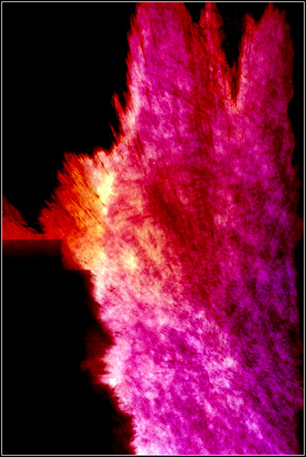
This one doesnt work so much for me. The vibrant color is nice, but its not enough to carry the image. Where in the first the shapes and patterns are a great compliment to the colors, this one just seems to be a bit flat. Almost like a big splatter on a wall with no real purpose or interest grabbing element to make it more than what it is up front. (from the thread) |




 Add photograph to your favorites
 Add photographer to your favorites

 Photographer found comment helpful.

