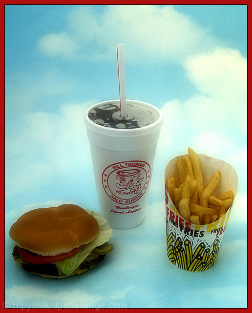
Interesting choice of a red border for the picture - I'm sure you picked it because of the product logo but it's pretty high contrast on the blue background. Overall, the image seems too softened to me (which you're probably thinking "um, yeah, the point of heavenly?!?) but it's too distracting for my taste.
Burger could show more detail, just a bit too much in shadow. Would have been nice to see some light shadows to "sit" the objects in the clouds; as is they appear to be floating in space rather than part of the scene.
Love the concept. Heavenly. Clear shot with good contrast.
I'm sure some people will tell you they don't like the red border. I do - I think it works well.
background fit! for a product shot though, I would have liked to see a full thing of fries and a beautifully composed burger. possible different lighting






 Add photograph to your favorites
 Add photographer to your favorites

 Photographer found comment helpful.


