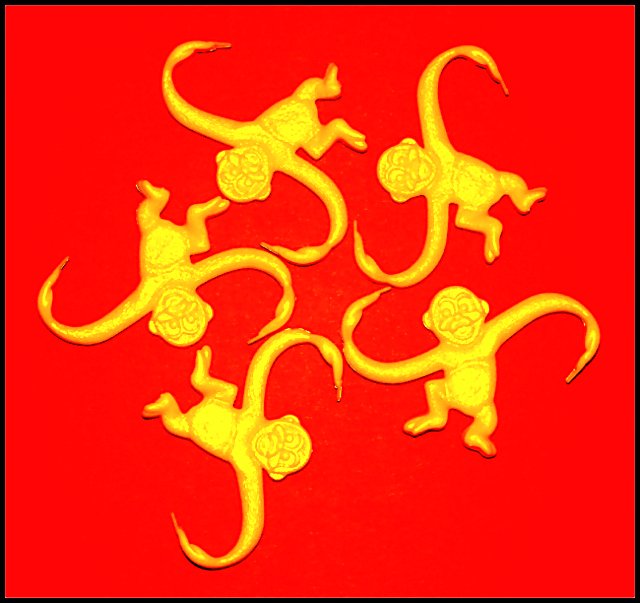
The monkeys are not very sharp and I see some color patching on my monitor.
Just as an idea for exersise: retry the shot on the totally black background, so that there is no red color casting on the edges but use the additional red light to pour it a little over top. Then replace background to red in Photoshop. I think the composition will look more distinct.
Cute idea but with the bottom monkey being slightly off, it disrupts the symmetry. The lighting is also a little harsh for my taste. I wonder if it would have worked out a little better had you only used one monkey and utilized the rule of thirds in some way. Anyway, I can't give you a score so take the comments for what they're worth. ;-)
cool arrangement, but a little oversaturated i think. kind of hard to look at. and while the arrangement is cool, you left a big gap between to of the monkeys at the bottom, which throws it all off...





 Add photograph to your favorites
 Add photographer to your favorites


 Photographer found comment helpful.


