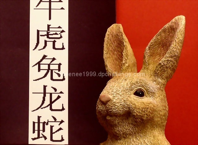
This was taken with a red background and I printed the zodiac symbols in chinese and placed in on the background, basic editing was applied, had to blur the seperation line between the red and black. Used auto enhance in my photo editing program to get rid of the haze.
Statistics
Place: 45 out of 77 Avg (all users): 5.1419 Avg (commenters): 5.8333 Avg (participants): 5.0328 Avg (non-participants): 5.2128 Views since voting: 909 Votes: 155 Comments: 8 Favorites: 0
I don't know why, but when I view this I think of the Jackalope (from the Tonight Show - Leno). Or maybe even Caddy Shack. Oh well...... Good color, exposure, focus, etc., kind of funny.
Nice layout graphically. The jaggies are distracting on the characters and that the 'year' character is cut off at the top. But, I like the texture of the rabbit against the backdrop.
I really like the obviously 'designed' aspect of this shot. The colour choice is effective and helps make the shot very elegant. However, I just wish that the font you used wasn't so pixelated. Kudos on making the rabbit look at his character. 6
Not really sure the background works for my here. I think I would like to see all one color for the background. I like the addition of the oriental letters. Kind of makes it tie in with the whole "chinese" zodiac theme, although I have no clue what it says or even what language it is. Your focus on the bunny is good, and Lighting is good, although there is a bit of a distracting shadow from the bunny on the darker 1/2 of the background. Overall good though.
Graphically the photo is nice - the two color background, white banner through one side. The bunny is crisply portrayed. The banner is a bit odd - It doesn't go all the way to the bottom and seems cut off at the top. The bunny himself (herself?) is adorable, but a bit corny. The lighting seems a bit yellow, color correction would solve that.





 Add photograph to your favorites
 Add photographer to your favorites


 Photographer found comment helpful.


