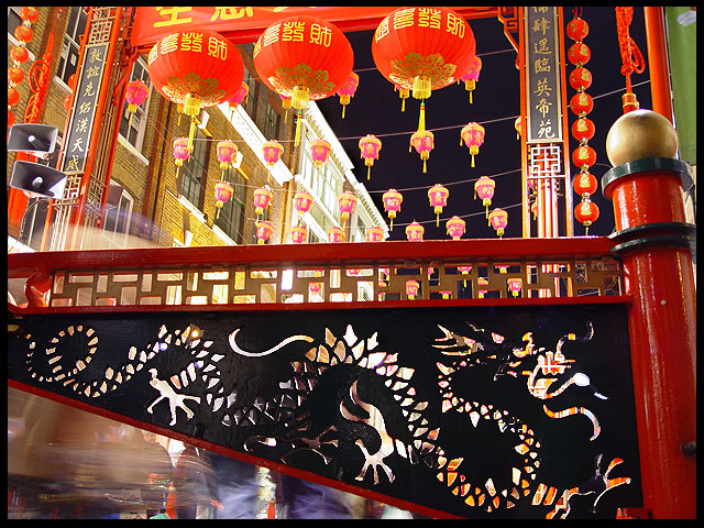
This is a very busy photogrpah with lots going on and lots of colors to catch my attention. i think it helps very much and works well with the repetition found in the image. the three large orange lanters, the lanters in the background, the cut out's on the railing. I think all of these are important. The image seems a little washed out in the brigh whites, on the building in the back and on the speakers... and the blacks don't seem quite black. perhaps it is 1/2 stop too light. I think the two speakers on the right are a bit distracting. They are a very odd shape (compared to the rest of the picture) and odd color, and if it were me i would crop them out. Interesting colors, and a very active shot.
hope this helped, and remember it is only my opinion.
- from the critique club -
I liked the composition of this. Your shooting angle, frame filling, combination of still & motion, wow colors (lanterns) and sharpness made in one of the most interesting photos in this challenge for me.
It is a busy scene, but it manages to entertain the eye for quite a while. I gave it a 9.
This shot is very busy and many of the elements do not appear to really be needed. For example the speakers on the left hand side do not fit in with anything else in the shot. I think a different shooting angle and/or different crop would help.
TC
This is so colorful! I really like this picture. Really fits the challenge well, I think. For some reason though, not sure why, I wish the bottom of the sign hadn't been cut off... But overall, very good picture!





 Add photograph to your favorites
 Add photographer to your favorites

 Photographer found comment helpful.


