|
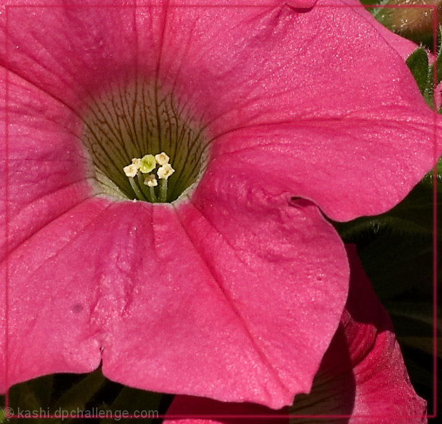
I thought this was a pretty good flower shot when I voted - great crispness and very good color. I think scorewise you may have done better with just a little softer light to create more depth and possibly of you'd rotated it to put the center of the flower in the lower right. Americans in particular gravitate to the lower right, because we read from top to bottom, left to right. The opposite is probably true for those that read oppositely. It just creates a better balance to the eye for some reason. |







 Add photograph to your favorites
 Add photographer to your favorites

 Photographer found comment helpful.


