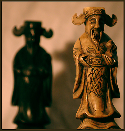
Greetings from the critique club! I missed this one when looking through the Zodiac challenge - first impression, I like it very much. Looking a little closer, I have to agree with many of your commenters - the shadow of the back twin is really needs to go. I'm thinking that a little bit of backlighting (just off to the side) and behind the back figure might have eliminated the shadow and allowed for a little more sharpness for that figure as well. Overall, I think the exposure was very well done (better than most of my indoor shots!) and I'm surprised that this didn't do better!
Great DOF usage. Good theme exploration. I had an issue about the shadow behind the black piece. To me this shadow must be removed. Using a second light on the background you can do it. Or simple put the objects more distant of background.







 Add photograph to your favorites
 Add photographer to your favorites

 Photographer found comment helpful.


