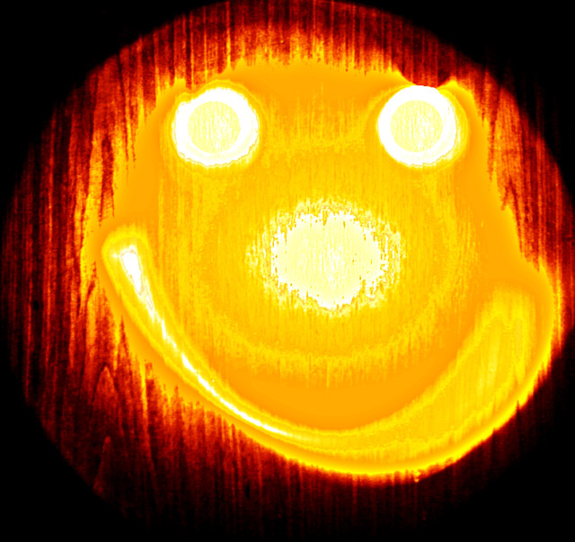
I think this image is too cliche for me to find very interesting. The image additionally seemsquite burned out on the whites. The yellow color you achieved is a very bright exciting color, but perhaps is distracting with the red and burnt white. I also find the wood grain behind the image distracting. Perhaps if this image had been taken on a white wall it would have worked better.
hope some of this helped.
keep up the good work... from the critique club.
No need to appear to apologise in the title!.
I went to a gallery last night specifically because there happened to be a "PWL" exhibition.
Your picyure is far better than many that were on display + you have got the essentials of PWL.
As far as I am concerned, you are one of the few that caught the spirit of the challenge to a T. Funny? Different? Yes. You get high marks for effort. Aren't smiley faces waht teachers put on papers for effort also?!
Extra points for making me laugh! I actually think this is one of the better ones of the challenge because it's simple, effective and, of course, was painted with light.





 Add photograph to your favorites
 Add photographer to your favorites


 Photographer found comment helpful.


