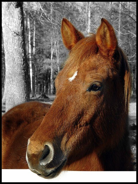
The horse is good, I like the coloring and texture, and it has a somewhat soft look too. Not fond of the desaturated backgroun, but I can see how it's used to isolate the horse. I really dislike the white bar at the bottom, tho. It's slanted and quite a distraction.
Very nice Sharp focus and nice work how do you do that with the colours I am not sure I like the white bar/fence along the bottom and It would be better to clone that out I think Nice looking horse fits the challenge.7
Great lighting and use of selective color. But I'd have preferred the white border at the bottom to continue all the way around, and to be the same neutral tone as the B&W part of the image.
I like the profile shot of this horse quite a bit... the angle is very nice. The desaturation of the background also seems to work nicely here to help bring the horse out into the foreground more. The part of this photo that looks odd to me is the fence railing at the bottom. If there was some grain or texture on that rail to make it obvious as to what it is, I think it would be a stronger image. In the context of this photo, it looks like it could have been edited in rather than being part of the natural image.
Very crisp and clear! I do like the selective desaturation and how you framed it: due to the lower white part (is it a fence?) it apears to be very 3-dimensional. I have the feeling as if the head comes out of my screen. Good luck!
the composition is beautiful, but the white bar, I'm going to assume is a fence, is highly distracting. If it had been faded to a gray to match the background I think the affect would of been better. Overall a beautiful composition, and a beautiful horse too =)
Beautiful capture of a beautiful horse/yearling? I love the background effect and the pose, but I find the very white rail in the foreground to be distracting. Color it gray and the photo would be awesome.
This is a good shot and the rich coloring of the horse is a good idea in contrast to the black and white setting. I don't like the white stripe at the bottom though - maybe that's where Year of the Horse would have gone, though, eh?
I don't understand why there is a white band .... I find it very disturbing. Same for the b/w back ground. Your horse alone is very beautiful, I think that all the artificial around is not necessary.
Really nice horse shot. I like the desaturated background. I think that it would have been cool to have used a white order all the way round, so that it looked like the horse's nose was coming out of the frame.






 Add photograph to your favorites
 Add photographer to your favorites


