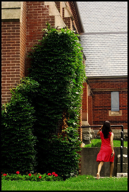
i think since yellow and orange are more summer like colors it would have been better to have her wearing those colors because she would also stand out better.
the red green contrasting elements are a nice touch and show consideration of the frame. red flowers, green grass, red dress, green ivy and finally large red building. dont know if the person was a placement but it works great!







 Add photograph to your favorites
 Add photographer to your favorites


 Photographer found comment helpful.


