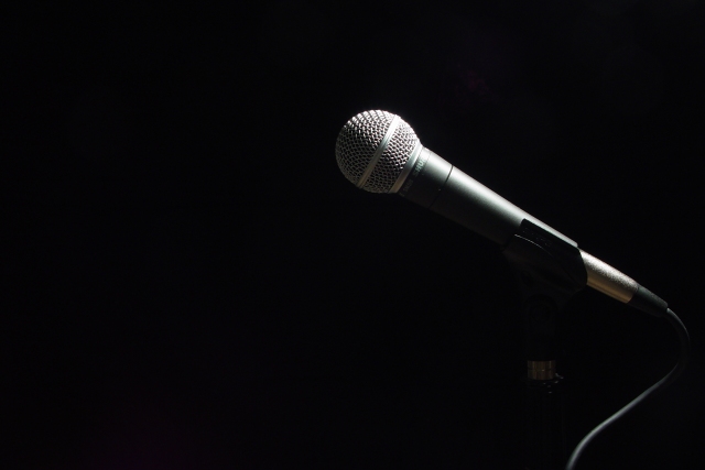
I had the idea in my head for this shot for a while. This challenge was perfect for it, so I finally did it. The shot itself was easy. Naming it, though, was quite difficult.
Statistics
Place: 19 out of 218 Avg (all users): 6.4722 Avg (commenters): 8.2333 Avg (participants): 6.6913 Avg (non-participants): 6.2857 Views since voting: 1708 Votes: 324 Comments: 31 Favorites: 3 (view)
Less is more - Perfect in every way, I would hang this on my wall - It gives me the strange feel of a tribute to a fallen performer. Good Luck, Gotcha - 10
While outstanding from a technical POV, I would have loved to see traces of the mike stand in this photo. Still, it is at least a 7, and therefore gets rounded to an 8. - mjcecil
Good example of simplicity winning out over complexity. It's just a microphone but with the the spot lighting there is a great sense of anticipation. Excellent touch leaving the left of the frame open and seeming to invite the performer to the microphone. My eyes and brain keep looking to the left expecting someone to walk in and start singing! Well done. Score: 10 Courtenay
Sometimes art is what the viewer brings to it, which may or may not coincide with the artist's intention. To me, this picture could be cover art for the movie "Lenny," a biopic about the late Lenny Bruce, seminal standup comedian "who broke boundaries of language and subject matter by questioning hypocrisy and telling it hilariously like he saw it" (Amazon summary). His story is comedy with a tragic lining, as it ended in a morphine overdose. Much of his career was a joyous but frenzied rebellion against censorship. For these two reasons, the abandoned microphone represents (to me) a poignant homage. Since our culture reads left-to-right, the microphone’s placement invites the eye and emphasizes the negative space to its left -- a void aching for a voice. This photo both meets the challenge and moves me emotionally. 10
Composition: I like your composition and lighting if I was nitpicking I would say that it has to much empy space on the left but you would have to be careful as if it moved to much to the centre it would lose its impact 8 Lighting: 6, Appeal7 Total Rating 8 Sulamk
Lots of negative space in many photos... but this is the only one where the space makes sense, it means something, it contextualizes the subject and the picture would mean something else without the space. Excellent conception, well executed.







 Add photograph to your favorites
 Add photographer to your favorites


