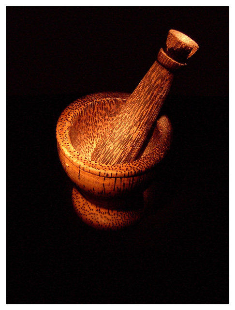
A souvenir from my sister when was travelling in Asia. Lit with a miniature flashlight inside a paper tube to narrow the beam. Took 50-60 shots before I got one I liked. No post-edits except crop, border and re-sizing. First challenge in months. Wish me luck.
Statistics
Place: 20 out of 120 Avg (all users): 6.0753 Avg (commenters): 7.4000 Avg (participants): 5.8354 Avg (non-participants): 6.2523 Views since voting: 3188 Votes: 186 Comments: 20 Favorites: 1 (view)
I agree with the comments about the nice lighting and texture. I also think it a bit odd to have a subject with a "heavy feel" floating in the middle; I think you can have the same amount of black space but with the mortar sitting down near the bottom.
color balance cropping tighter thank you plus some light in the shadow area to bring out just a bit of it. Maybe a reflective white surface would be enough.
Something about the simplicity of this shot really grabs me. You have chosen a subject with nice texture, and your lighting is quite dramatic. Nice. 10.
The subject and lighting are beautiful. The colors are deep and rich which lend to the textures. The only small issue I have is the composition. The subject is too centered in the frame. Maybe move it to the left and down some or crop the left and bottom off a little. That would give this that WOW composition. Good luck !
Good composition. I would've like to see the light diffused a bit more and generally softer. I think it would've added a little more of the element of mood to the picture. Still a good photo.
I think your subject choice here is strong. The composition feels a bit strange for me.. it looks like your subject is floating in space with the darnkess... I think a little light on the surface could be a nice enhancement :)
Very very beautiful. The texture of the mortar comes really alive. I am not big fan of thick white borders around black images, it realy distracts from the beauty of this photo. The image is very good on it's own, no need for a thick frame.
There are some beautiful pictures in this challenge and this is another one of them. Personally I would like to have seen it cropped a little tighter. There would still be enough black to leave the pestle and mortar "leaping out of the page"
I will copy a note though that I have copied to some other people in this challenge.
---
My only concern is, as you may have guessed from the amount of discussion on the forum re "painting with light" is whether it is painting with light.
Having been lucky enough to judge what is now a few hundred competitions in the last 30 years I feel I should say the first thing that happens is that they are sorted and any that do not immediatly seem to fit the category are dumped (hard but a fact). This is why so many competitions also run an "open category". Your picture, as impressive as it is, would, I feel have been rejected at this stage. "Painting with Light" has a fairly tight definition in photography but still allows a lot of lattitude for creativity.
I suspect that your scores may not reflect what the picture is worth which is a great shame.
I believe if I was judging in another category I would have gone for an 8 possibly a 9 because you have managed to getget the light to work the textures so well.
I do hope you understand my reasons for marking it down
David
Good use of light. I only dislike the perspective...or maybe it's the crop? One of them seems a bit imbalanced. It could be all the dead space at the bottom, making this look as if it's floating..? Not sure. It's a good shot, very good. Nice focus and as I said good lighting. All the best in the challenge.






 Add photograph to your favorites
 Add photographer to your favorites

 Photographer found comment helpful.


