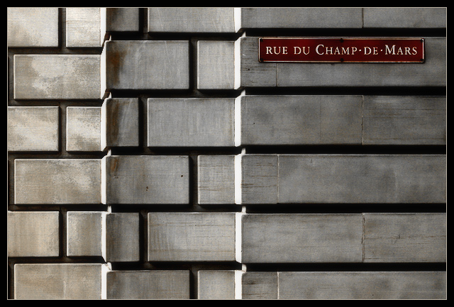
This is a retake of an image that I took a few months ago. I really liked it, so I decided to reshoot it for this challenge. It is the side of the Montreal Courthouse, in Old Montreal. The first time I saw this, I was waiting to pay a parking ticket, and noticed the textures on the wall as the sunlight hit it in the mid afternoon. This time, I chose to keep it in colour. Here is a link to my original attempt.
In PS7: slight rotate, slight crop, levels, resize, reduce all the saturation (except red) to zero, slightly more levels, very slight USM, Gaussian blur and fade to 25%, border.
Statistics
Place: 16 out of 202 Avg (all users): 6.4395 Avg (commenters): 8.1563 Avg (participants): 6.3211 Avg (non-participants): 6.5324 Views since voting: 2765 Votes: 248 Comments: 38 Favorites: 8 (view)
Great shapes and pattern. Just very interesting image to look at. The sign stands out from the grey background. Good sharpness. Love the depth of it. Really well done.
Very interesting composition, lovely tones and texture, and a smart sign too. Very neat and hangable. If anything, it's a little wide of the brief as the sign isn't technically a road sign but it's seen from the road. But it doesn't really matter since I would much prefer to see a shot like this repetively than a shot that simply wins a challenge. [9]
Very very beautiful shot - your control of this exposure is so assured - the over-exposing of the lateral planes here gives an Escher-like optical illusion if one looks for too long - you lose the ability to see the true depth of the image in a confusion of different planes. Only slight draw-back is that it's more about the wall than the sign, but that's a minor point in such a good shot. 9
Hmmmm... Have you won a lot of ribbons? This just has that kind of feel. I know this feeling too, of something familiar even if you don't know what it is. Its classic. Great feel. I like the lines and shapes. Maybe I'm way off? 9
You've captured very nice, bold contrasts. In my personal taste I like this, although I can see how it wouldn't be for everyone. Stick to your own judgment when it comes to what style works in your photos at any given time..
Simple and effective. The only thing that i don´t like in this photo is the direction of the light - i think the elements that are receiving the lateral light are a little bit disturbing.
spartan, yet dynamic composition. i love the color and texture of the bricks. you angled this just right for capturing the geometry of the pattern properly. nice work.





 Add photograph to your favorites
 Add photographer to your favorites


 Photographer found comment helpful.


